 For this animation project I wanted to animate something meaning to me. After some thought, I decided to animate a scene from one of my favorite games, Night In The Woods. This scene has two of my favorite characters and was a fairly sad scene to go through. The whole process was as hard as I thought it would be, but I enjoy seeing the end product. For the past few years, I've been wanting to try animating, but I've always been afraid to because I didn't want to fail myself. This class helped me get out of my comfort zone in that way and I'm very happy for it. I'm glad I finally overcame that fear and will maybe do more animation in the future. While there are things I'd want to change, I'm still very happy with the outcome because I didn't think it'd end up this way. It's a little rough around the edges, but everything is the first time you try it.
0 Comments
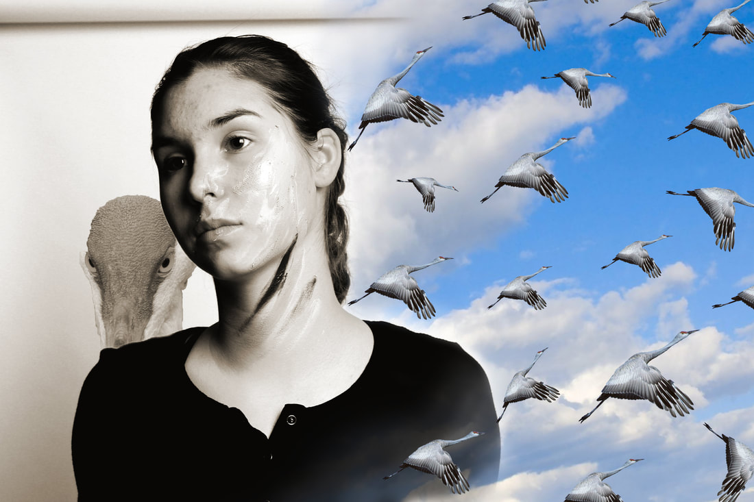 With this piece I showed Depth and Unity through the repetition of the birds, having part of the sky overlap my subject, and by having contrasting color pallets (Normal color v. Sepia tone). I lucked out with having the lighting of both pictures matching up very nicely. My old photo was one I took of my friend Natalie last semester that I wanted to use for one of my projects but the background wasn't cooperating with me so I didn't use it. I wanted the picture to have a mythical, surreal vibe to it and I thought that the birds/sky kinda matched up with my original photo. I was kinda going for a like, Deity of the sky or something of that matter. Getting the sky to blend nicely in and out around Natalie's shoulders was pretty difficult, but I don't think I'd do anything different. I'm just pretty proud of this entire piece as a whole.
 For the choice project, I decided to do a few studies of a Snow Leopard using the Wacom Tablet. I decided to do the Snow Leopard because I wanted to get to know more about it's anatomy and because I love their long fluffy tails. The style I used has more of pencil sketch feel because I like using that style the most. I'm most happy with how they all turned out in the end, but in the future I'd like to do a study of the whole animal instead of being afraid to do so. This project helped me understand that it's important to keep looking at the subject you're sketching so you can place everything in the right place, even if the size is a little off. I will apply to to any other studies i decide to do in my spare time.
In these two projects I learned that graphic design is slightly more complicated than I had originally thought. You need to make sure everything connects to each other and that it's distinguishable to the common eye. I also saw that there is a range of artistic careers that I could pursue if I really wanted to, and that I wouldn't really have to stick to one exact thing. But for me, I'd probably stick to something more in the photography or painting side of the careers since that's what I know more about and are more comfortable with. I'm sure I'll dabble in the other fields during my time, but I'll most likely major in something in one of those two fields. For the Day of Service logo I drew inspiration from the entry I did Sophomore year. I wanted it to be a slightly more realistic bulldog and to have water incorporated in it. For the planner, I wanted more simplistic. My original idea was to do the colored background as watercolor, but I couldn't find a brush that would given me the wanted effect. So in the end, I went with a brush that went more acrylic style I guess you could say. I didn't really have any inspiration for the planner though. The idea just kinda popped in my head and that's what I went with.
 I'd say Balance, emphasis, and contrast are used in this piece. Balance is used because while the subject is right in the middle, he's also in other squares in the rule of thirds grid. I'm not exactly sure if the peach tones would be considered a contrasting color to the green bush background, but I consider it a contrast. And the big emphasis of the piece is the only thing digitally painted in the picture, the small boy. I think that's also how I showed depth in the piece, by making only one thing painted and keeping the bush from the photo in the background. I used so many layers in this piece, mostly to make sure if I didn't like how I did one part of the body, I could go back to how it originally was before i made that change. Working with the tablet was completely fine for me, just working with Photoshop was a bit of a pain.
For the imagery, I just painted over a picture I had taken last semester as an option for one of my studio art projects. I wanted to do something I normally do on my own, which is doing portraits, and i wanted to actually use the photos i took last semester so they wouldn't be for nothing. I wanted to keep the background of the original photo to, i guess, give a little more contrast to the painted portrait. The order I did this in was kind of messy. I started out getting the base colors on the shoulders, then face, then the hair, and I blended it a bit using the program I use at home. I kinda had to do that part of the piece multiple times because it wasn't turning out the way i had wanted it to, and the colors just weren't matching up with the picture. The outline I did came later in the piece when I was making sure all the details were placed properly. I think the most successful thing I did in the picture was getting his torso to actually look like a torso and not just a blob of colors. Through this process, I think I kinda learned more about how to do hair in a portrait, but I know i can still improve on the eyebrows and eye lashes.  The title of this work would be 'Gaze'. The principles most prominent in Gaze would be balance, emphasis, and visual movement. The emphasis of the piece is my friend, Natalie, lying sprawled out, your eye moving from her to the checkered design along the edges of the picture that creates balance and visual movement. I'm not really sure what kind of mood I get from my design, I've never really been good at picking out the mood in any sort of piece. My imagery didn't really have a statement to show. I was just trying to make it the best I thought it could be without distorting the original image. With this project, I kinda learned how to use Illustrator to an extent.I think the most successful thing I did was choosing a filter that didn't distort my original picture too much, but I still don't think I changed very much in the picture. I just didn't know what else to add or do to it without ruining it at all.
 Balanced is used in this piece with the text and pasted image in the bottom left hand corner that used to have nothing and with the emphasis of the piece taking up nearly the rest of the space. The portrait part of the piece has more color saturation than the background, which is two separate layer masks with the layer filters changed. The image I pasted in was another portrait of myself that my friend took as an option for her Studio Art project last semester. I used this photo because I honestly didn't know what else to put in the picture that wouldn't throw it all off. I also added in kind of a galaxy because I wanted to have some color in the background, but in a softer sense. The filter I enjoyed the most was the oil paint one because it kinda of gave me almost a Van Gogh feel if I played with the sliders certain ways. I also added in my misspelled last name for the text because it's become sort of an inside joke between me and some friends the one time I accidentally forgot the last 'A'. I think the most successful thing in this piece is the nice color saturation of the face, but I think it could pop out a bit more from the background, or even have a better contrast.
 The most interesting project I saw was the painting project. The image was sketched out initially using a picture for reference, then painted over using different brush styles. Kara Nedvar's piece intrigues me because of the fabric's texture how how nearly realistic the piece looks as a whole.
I already knew most of the tools in Photoshop discussed in the first few days of class because of previous classes I took. I don't really have any concepts I want to explore personally. I just want to get a better handle on painting digitally with a different program and expanding my portfolio. I've already been painting digitally on and off for the past maybe 5 years, so I already have good hand-eye coordination with the tablet. Using Photoshop as a painting program is extremely new to me because I've only ever used it for photo editing and my go to program is Paint Tool Sai. I don't really have any projects I want to pursue in this class, but I do want to hopefully get a piece or two for my studio art concentration out of this class. |